Digital Tutorial: Creating the Santa Fe Boxcar
Software Used
I used Adobe Photoshop along with a logo that was initially created in Adobe Illustrator. However, you could do this tutorial entirely with the free and open-source application Gimp.
Blank Rectangular Canvas
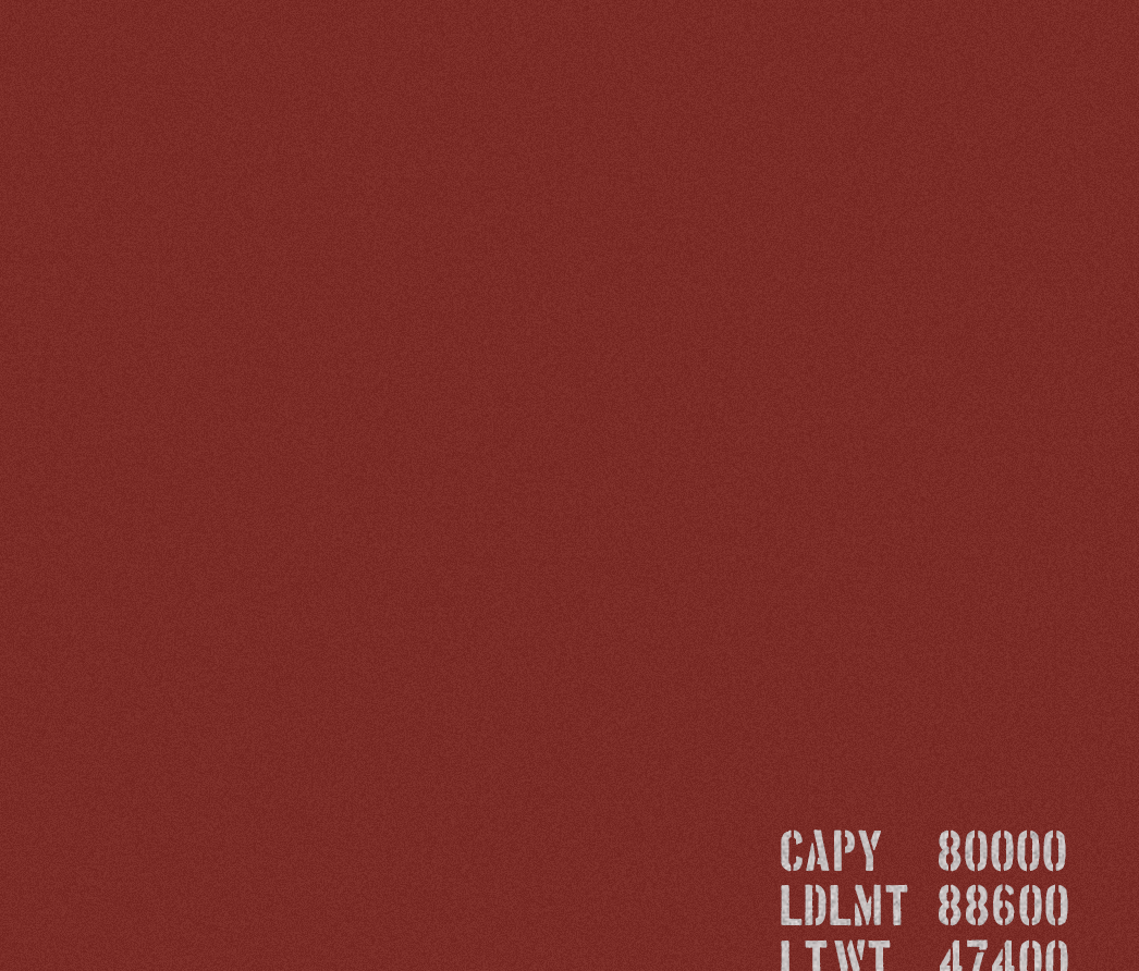
It starts like this, an open rectangle filled with the color of a faded red boxcar. They are everywhere out here in the southwest so it shouldn’t be hard to find one. Take a picture or go from memory. Fill the background with this color (#7a2d28 used here) and add some noise for texture.

Base Color #7a2d28
Most boxcars have some cargo capacity information stenciled onto them. Add some text in a stencil-type font. I used Boston Traffic Regular for this image. Play around with the layer blend mode so it appears the text has been painted on.
Add stenciling
Find or create the Santa Fe logo. I created this one from scratch as a vector in Illustrator. For fonts, www.railfonts.com has a great collection of fonts used by older train companies and related businesses. If you do not want to spend money on the font, Cooper Black is a close substitute. Use the same layer blending technique to make it appear painted on. Even better, remove a few random spots to make it looked chipped in places.
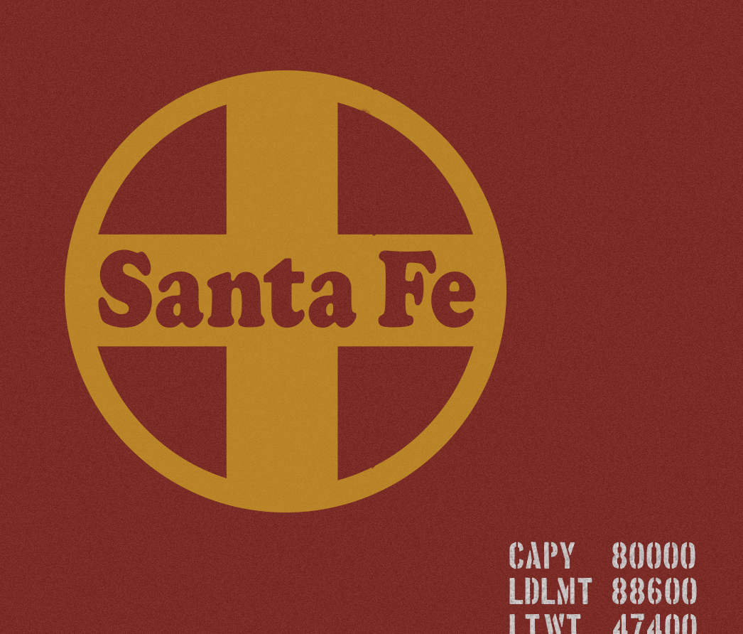
Add the Santa Fe Railway logo.
Create the seams. Boxcars are simple internal frames with flat steel seamed and riveted into place. The seams here are simple lines, with a bevel/emboss effect added. Opacity was adjusted to help them blend in.
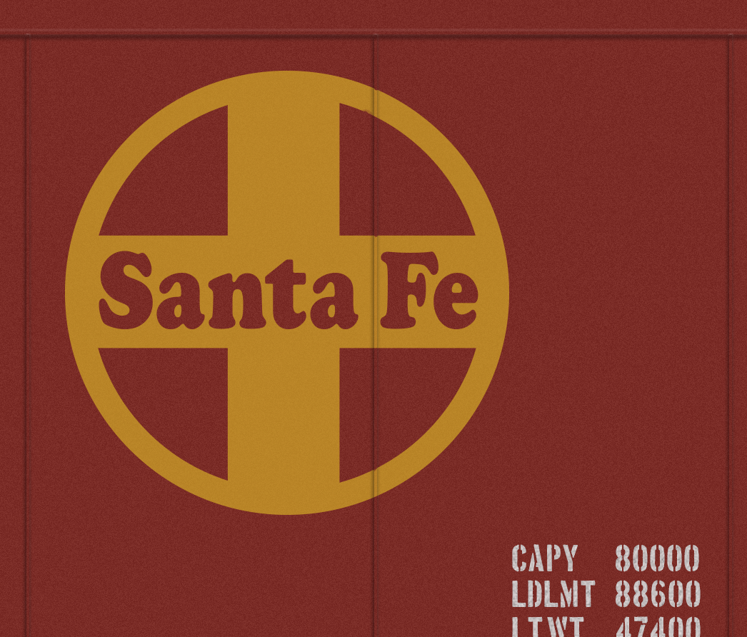
Santa Fe Railway Boxcar is taking shape with seams added.
The rivets were created in a similar way to the seam lines, simple circles with bevel/emboss gradient added (grey) and then blended into the background using the layer blend modes. After creating one it is best to cut/paste the rest.

Santa Fe Railway Boxcar – Rivets added.
It is subtle, but the logo had to be funged a bit where it covers rivets and seams, so it appears painted on an uneven surface.
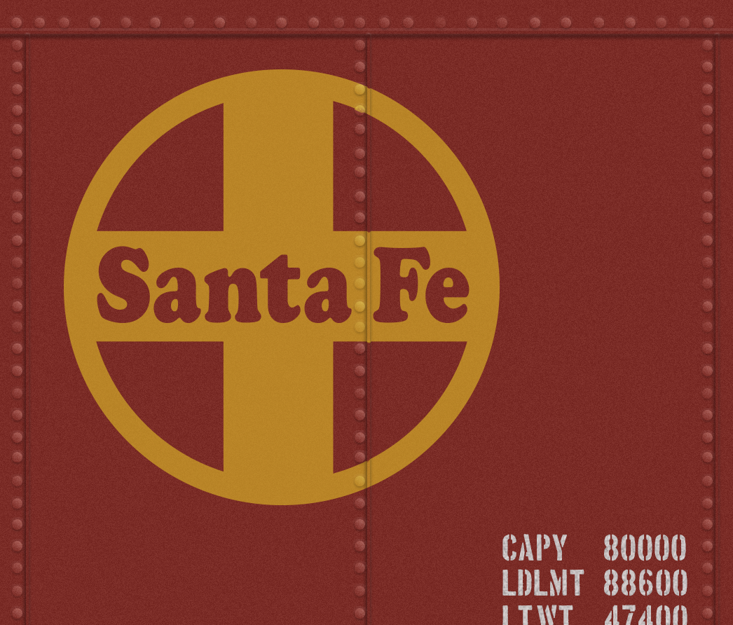
Fudging around the logo a bit to match surface appearance on seams and rivets
I haven’t quite figured out how to make rust look realistic (yet). Instead, I found an image of rust from a junkyard/ghost town photo shoot from a long while back. I used this and layered it across the image. Opacity was adjusted until it looked good enough, something like 20% opacity.
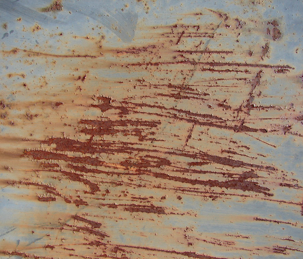
The rust texture image
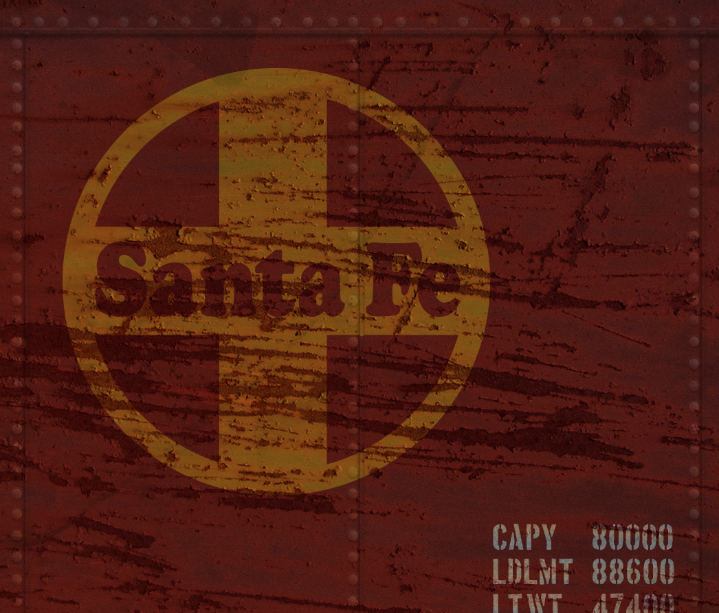
Reduction of the rust layer opacity allows the underlying image to come through.
The image needed lightening up and then a hue reduction to make it look faded. This is the final version.
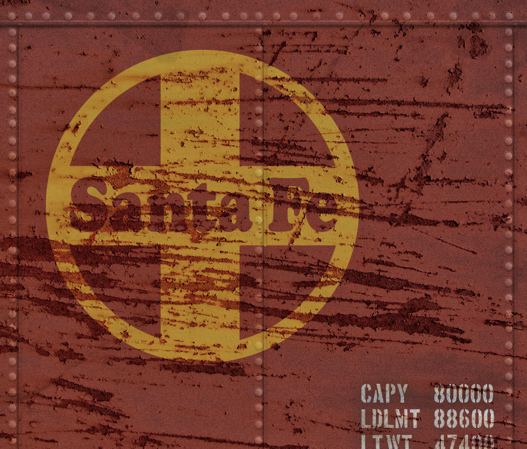
Santa Fe Railway Boxcar – final version after lightening and adjusting hue for faded look.
Recent Comments